
Digital Minimalism in Social Apps: Stop Doomscrolling
Digital Minimalism in Social Apps: Stop Doomscrolling
The Gladly Team
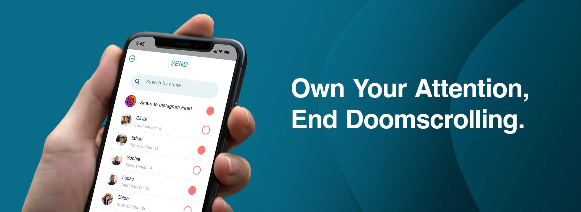
You unlock your phone to double-check a calendar event, but a red badge notification pulls your focus. Twenty minutes later, you find yourself four layers deep into an endless content stream, watching strangers argue in a comment section while your original task sits forgotten.
You didn't consciously choose to spend your evening this way. Your thumb moved on autopilot, guided by subtle user interface prompts engineered to maximize time-on-device.
This quiet sense of attention drift isn't a personal failure or a lack of discipline. It is the natural outcome of software built without structural stopping cues.
A growing movement of people and users are pushing back against this default digital environment. In fact, dev team designers are starting to pay attention as well. By embracing digital minimalism in product design, we as humans can create tools that serve human intent rather than exploiting human vulnerability. This is certainly a validating feeling since Gladly was originally and purposefully designed for Digital Minimalism before it was even cool!
However, Digital minimalism in mobile app engineering isn't about avoiding mobile technology entirely. It is about demanding that software architecture respects our finite attention and supports deliberate, real-world living.
The Psychology of Choice Architecture and Attention Drift
To understand why modern feeds hold our focus so aggressively, we must examine the user experience mechanisms built into app architectures. Contemporary platforms are engineered around choice architecture—the structural layout of options presented to a user.
Decision Fatigue and the Loss of Structural Stopping Cues
In physical environments, activities possess natural structural boundaries. A book chapter finishes, a meal concludes, a gym has walls or a theatrical play rolls its curtains closed. Behavioral scientist Herbert Simon called these bounded rationality anchors.
Infinite scrolling intentionally strips away every structural stopping cue. As content continuously appears in a mobile interface without interruption, executive functioning research by psychologist Roy Baumeister shows that your brain must actively choose to stop scrolling at every single frame. It can be tough to stop!
This continuous micro-decision requirement depletes your executive resources—a psychological phenomenon known as decision fatigue. As cognitive reserves drain, your capacity to close the application declines exponentially, trapping your attention in passive consumption.
Intermittent Variable Reinforcement in Software UI
In mid-century behavioral psychology, B.F. Skinner proved that subjects display the highest rate of repetitive behavior under variable ratio reinforcement schedules—when rewards occur unpredictably after an action.
Modern touch interfaces embed Skinnerian variable ratio reinforcement directly into interaction gestures. The pull-to-refresh mechanic mimics a physical slot machine lever.
Because you cannot predict whether the next pull will deliver high-value communication or uninteresting noise, dopamine spikes in anticipation of the reward, transforming a simple software refresh into a subconscious reflex.
Basically, we keep swiping to see what better thing could be next.
Nudge Theory and Default Architecture
Nobel laureate Richard Thaler and Cass Sunstein introduced Nudge Theory to explain how subtle defaults dictate human choices. In software design, defaults are extraordinarily potent because humans overwhelmingly accept and prefer pre-configured states.
When apps default to infinite auto-play, real-time push notifications, and algorithmic feed ordering, they nudge users into continuous engagement without requiring conscious consent.
Reversing attention drift requires shifting software defaults: making bounded delivery, quiet modes, and finite feeds the primary system architecture. Some people just give up and delete the app entirely, choosingly losing the benefits it did have, given the frustration of the deficits.
Asymmetric Friction Engineering
Friction in interaction design refers to the cognitive or physical effort required to complete an action. Feeds engineered for doomscrolling create severe asymmetry in friction.
Consuming content carries zero friction—an effortless swipe—while exiting, closing, or reaching out directly requires navigating menus and making conscious choices. Re-engineering social spaces means restoring symmetry: making mindless consumption high-friction or impossible and purposefully making intentional connection low-friction.
The Reality: Why Algorithmic Feeds Break User Intent
For over a decade, digital platforms blurred the line between communication utilities and broadcast media networks.
Instead of delivering updates directly from your close contacts, algorithmic engines re-order content based on engagement probability and watch-time retention.
This architecture creates systemic points of user friction: - Cognitive Overload: Processing hundreds of un-vetted visual items overloads working memory and disrupts deep concentration. - Intent Disconnect: Users open applications with a specific goal—checking on a friend—and are immediately detoured by algorithmic discovery algorithms. - Choice Erosion: System-driven recommendations remove user autonomy over what information enters their cognitive environment.
As a result, users are using mobile apps for the intended purpose of human connection, but get derailed in the topically vast and endless feed of videos and other media. We hardly get to connect with our friends on social media.
The Solution: 3 Architectural Rules for Minimalist UI
The intention of Gladly was to have simplified and structured face-to-face communication using our most powerful tool in existence (so far)... our mobile phones.
Creating digital spaces that resist doomscrolling requires embedding minimalist principles into application design and engineering requires 3 rules:
1. Hard Boundaries and Finite Pagination
Software must honor natural endpoints. When a user completes viewing the media, the interface must explicitly stop and communicate that no new items remain.
Design Rule: Replace endless feeds with an explicit finite list that terminates with a clear indicator.
Design Application: Gladly specifically has a system designed to deliver a finite amount of smiles to the user, based on the amount of smiles they have in their queue. A user receives their smile(s) and the incoming media ends.
2. Intentional Pull Over Unsolicited Push
Instead of allowing the app to push real-time notifications randomly into a user's day, software should operate on user-initiated schedules.
Design Rule: Allow users to define specific daily windows when updates are retrieved, keeping the device silent during deep focus and rest.
Design Application: Gladly purposefully implemented a smile queue system, where received smiles gather into your queue, and you choose a range of time when you are to receive a smile. This alleviates the constant pinging of receiving random notifications, and focuses the app interaction to a time that you purposefully chose.
3. Metric Neutrality and Direct Payload Delivery
Remove public vanity scores, view tracking counters, and algorithmic sorting from the interface.
Design Rule: Deliver updates directly from sender to recipient in chronological order without modifying visibility based on popularity metrics.
Design Application: No like counts, no messaging, and no paid boosting of smiles. Users maintain simple, authentic touchpoints without vanity pressure.
Re-Engineering Social Spaces: Gladly's Choice Architecture
The minimalist design principles outlined above are built into the core structure of Gladly—you can explore Gladly's features to see the choice architecture in action.
Zero Infinite Feeds
Gladly eliminates infinite scrolling entirely. Smiles from your friends arrive in a bounded queue. When your smiles are done, the engagement ends.
User-Configured Notification Schedule
Instead of allowing unexpected alerts to disrupt your attention, Gladly delivers updates within a random point within a time range you configure.
Metric-Free Direct Touchpoints
Gladly strips away public likes, follower counts, and comment threads. Shares are delivered directly between friends as unfiltered, private visual interactions.
Moving Toward Empowered Software Architecture
Software should function as a reliable tool that respects human intent, not an engagement engine designed to hijack attention.
By selecting tools built on digital minimalist principles, you can regain control of your digital environment and build healthier habits while staying in touch with people.
A Simple Tool Built on Minimalist Choice Architecture
If you are seeking an application engineered around human autonomy, learn more about Gladly's core features. Gladly replaces infinite scrolling with finite, scheduled updates from real people that let you stay connected on your own terms.
Join thousands of real humans who have deleted toxic social algorithms for a calmer, happier daily connection.


Frequently Asked Questions
Q.What is choice architecture in mobile app design?
Choice architecture: refers to how choices are presented in a user interface. In digital minimalism, choice architecture defaults to finite boundaries, explicit stopping cues, and user-initiated delivery rather than infinite loading and automated popups.
Q.Why do infinite feeds eliminate natural stopping cues?
Decision fatigue: occurs when infinite feeds continuously append new content to the screen, removing natural structural endpoints. This forces your brain to make continuous micro-decisions to stop scrolling, making exiting the app increasingly difficult.
Q.How does Skinnerian variable reinforcement apply to UI pull-to-refresh?
Pull-to-refresh psychology: mimics a slot machine lever through variable reinforcement. Because users cannot predict whether the refresh will reveal high-value or low-value content, the brain releases dopamine in anticipation, reinforcing repetitive checking behavior.
Q.What is asymmetric friction engineering in user interface design?
Asymmetric friction: occurs when mindless consumption is designed to require zero effort (swiping down), while deliberate actions (exiting or messaging) require multiple taps. Minimalist design restores symmetry by making passive scrolling high-friction and intentional connection effortless.
Q.How do user-configured notification schedules protect focus?
User-configured schedules: batch updates into predetermined daily delivery windows. This prevents surprise alerts from interrupting deep concentration and eliminates the attention drift caused by continuous push notifications.
Q.How does Gladly embed choice architecture into its app design?
Gladly’s approach: eliminates infinite feeds and public vanity metrics, delivering finite updates from close friends on user-defined notification schedules that protect user autonomy and attention.